Buy This Book!
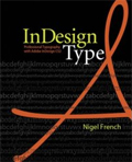
 If you care at all about type, design or InDesign (or any combination thereof), you should have Nigel French’s book: InDesign Type. I’m only partially through it and I can make that recommendation. This book is cleanly designed, well-written, and concise while being very comprehensive and thorough. I’m ready to go back and start re-working all of the body copy styles for my magazine based on the knowledge I’ve acquired after just a few days skimming through this book.
You can follow any responses to this entry through the RSS 2.0 feed. Both comments and pings are currently closed.


June 1st, 2006 at 4:39 am
I’ve been wanting that book too but it’s a little steep in price. With my Border Books 20% discount coupon, I may be OK.
June 2nd, 2006 at 12:34 pm
I have to say I disagree on this one. Here’s why I say this:
I picked this one up at the InDesign Conference (wish I’d known you were there, Michael, I’d have loved to meet you in person!) and found 22 typos, 20 examples of formatting errors (where different styles were applied to text that should match other text that serves at the same hierarchical level), images flip-flopped with their captions, and quite a few other examples of confusing layout or writing style. This is a book on *typography* of all things, and I think this lack of attention to detail hurts the book’s effectiveness immensely.
Several times a number of text examples are displayed near screen shots of settings that achieved the example looks. See pages 200-201. Figure 14.1 shows 8 paragraph rule styles. Facing this, Figures 14.2 through 14.8 show 7 paragraph rule screen captures of different settings, with *no* clear correlation to the facing page examples, nor captions exaplaining what the settings shown will *look like* in use.
The layout gives you impression that the examples shown are apparently paralleled on the facing page by the screen shots (as if they show the settings that made the examples). Confusingly, there are 8 examples on the left and only 7 screen shots on the right. You have to study the smallish screen shots to figure out if they relate, as the numbering scheme on the left hand page is not referenced by the examples on the right-hand page! That’s downright irritating. I found this occurs several times in the book. There’s even one example referenced in a cutline, but the example isn’t shown.
I did discover a handful of useful tips or techniques from it. To be fair, there may have been more, but it may be because I had learned a LOT at the conference, so much of the book had “already been covered,” so to speak. (Yes, I realize, this is a plug for the conference, unquestionably worth its value, and something I will repeat!). However, I do not feel this is *the* book on typography of InDesign. Perhaps the second printing will address these weak points.
I would *highly* suggest people look into another before purchasing: “The Complete Manual of Typography” by James Felici (Adobe Press). Note that it is not specific to InDesign, but its layout, examples, and clear writing style are far more effective in my opinion, no matter what software you use. Plus it is OpenType aware, and seems to reference InDesign’s more advanced type handling inthat regard.
Robert Bringhurst’s “The Elements of Typographic Style” is another wonderful type book, but I found more day-to-day practical application from Felici’s book. I think Bringhurst’s volume is more suited to true type lovers who can’t get enough ;-).
James
P.S. If there are typos and errors in this text, mea culpa. It shows we *all* need editors!
June 2nd, 2006 at 8:35 pm
Wow, James. You clearly looked this book over much more carefully than I did. I’m about 25% through actually READING the book, but had done a preliminary skim — reading a few pages here and there — before making this original post. I did notice a couple of captions that said the opposite of what they should have (i.e., example B’s explanation should have actually gone with example A). And it has made me look more carefully at those captions as I go through it.
By and large, however, I still think it’s a great resource. Many people look at software as their avenue to design solutions (which is a mistake). But since I can’t change that fact, I thought there was real value in a book that is grounded in basic typographic principles, but makes a direct connection for people to the software they use to work with type. I think the book fills in a gap that needs to be filled for many people.
I took real “old school” typography classes when I was learning all of this — before any of this software existed — so much of this was familiar ground for me, too. But refreshing one’s memory about the fundamentals is never a bad idea.
I also enjoy (so far) Nigel’s light, concise and direct writing style. Errors aside, I wtill recommend this book as an excellent reference for what people will spend eight to ninety percent of their their time dealing with in InDesign — type.
But I’m adding the books you suggested to my Amazon.com Wish List as soon as I’m done posting this. And now you’ve sped up my timetable for another feature I’ve been meaning to add to the site — a Designer’s Bookshelf, where I want to share (and allow others to share) recommendations for books that have nothing to do with InDesign, but are essentials for people who want to grow as designers.
Thanks for the in-depth post, James.
June 5th, 2006 at 12:20 pm
Thank you, too, Michael.
I can appreciate your point of view, and acknowlege that if someone were dedicated to knowing more about InDesign’s type handling, it does fill a gap. It just feels hastily assembled to me, and that was a letdown.
When you have the bookshelf up and running, there are a half-dozen great books I would recommend! (Okay, I read a LOT of them, but if I were stranded on a desert island with a solar power source and a computer, and I had to whittle it down….)
James